

Quick Summary
Participant materials play an important role throughout the clinical trial experience, but usability can be compromised during development and review cycles. As information is added and revised, documents often become longer, more complicated, harder to navigate, and exceed desired specs. Creating user-friendly materials requires more than accurate content. It requires attention from all contributors to readability, the information included, and how easily participants can find what they need. This article explores practical ways to evaluate participant materials and ensure they support participants at every stage of the clinical trial.
___________________________________
Making Clinical Trial Participant Materials Easy to Use
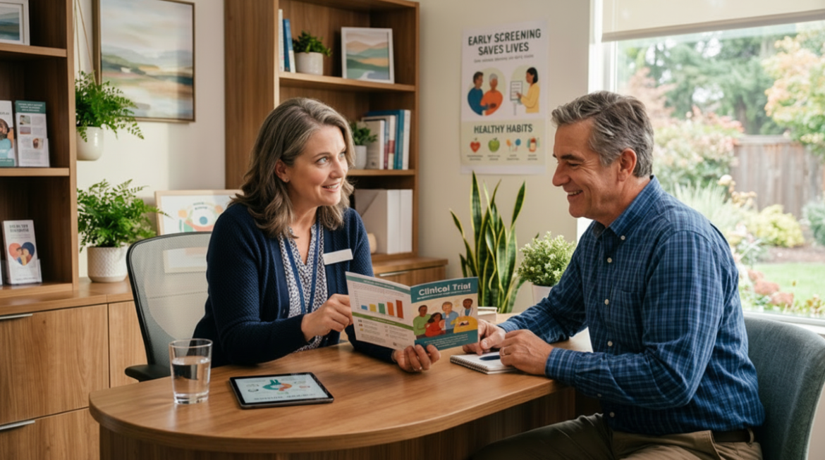
Participants navigate their clinical trial experience through a variety of means. This includes contact with study teams, information from participant materials, and directions from apps.
Considerable effort goes into developing participant materials. Contributors include study teams and medical reviewers, as well as the legal department. With honorable intentions, different people add, revise, update, add some more, and revise again. Each document, with its thoroughness and accuracy, is something to be proud of.
But when the dust has settled, the result must be put to the test: are the materials user-friendly?
Every piece we hand to a participant should pass the user-friendly test. Yes, that seems obvious, but it doesn’t always happen. Sometimes, the participant’s experience becomes a secondary consideration. Participant materials must be complete and accurate, but those goals should not come at the expense of usability.
So, what does the user-friendly test actually involve? Here are elements to consider:
1. Readability
Materials should be written and reviewed with health literacy in mind. The National Institutes of Health recommends aiming for a sixth-grade reading level, which is reasonable for user-friendly participant materials. But don’t go so far in refining your word choices that you’ve removed the precision of the language. Some words may increase the reading level score. But simpler alternatives don’t always preserve the meaning. For example, it’s important to provide the reader with the actual names of tests and procedures. Terms like “heart test” instead of ECG or “health check” instead of physical exam may improve a readability score, but they aren’t precise and can create confusion for participants. A better approach is to introduce clinical terms alongside a plain-language explanation the first time they appear, then use the same terminology consistently throughout the study materials.
Another important factor is maintaining consistent terminology. Changing terminology can create confusion. If a study period is called a “treatment period” in one document, it should not suddenly become a “study drug use period” in another. Participants should not have to wonder whether two different terms describe the same thing.
Consistent language helps participants build familiarity with study concepts and reduces the effort required to understand new documents. Before introducing a new term, consider whether an existing term already communicates the idea clearly. While the differences may seem minor to clinical trial teams, they can create unnecessary confusion for participants.
Readability is about more than reading level and terminology. Information should be presented in a way that is easy to absorb:
-
-
- One idea at a time
- Use bullet lists when appropriate
- Avoid long sentences
- Avoid long paragraphs, which create dense blocks of text
-
The goal is to make the information easier to scan, understand, and use without weakening the accuracy of the content.
2. The Information Included
Every participant document should have a specific purpose and stay true to that purpose. Before adding information to a document, it’s worth asking yourself whether it belongs. This consideration is important during writing and can become even more critical during revisions, where more information is often added to make materials appear more complete. Over multiple rounds, documents can begin to accumulate information that does not support their primary purpose.
Recruitment materials, such as brochures, should include eligibility criteria and mention the informed consent process. However, brochures are not visit guides. If the text tries to include too much, for example providing specific visit information, its usefulness is compromised.
A visit guide’s purpose is to help participants prepare for visits and navigate study activities. It’s not a consent document. Yet eligibility criteria and informed consent information can still creep in unnecessarily. Yes, those elements of a clinical trial are important, but the participant using the visit guide has already encountered that information elsewhere and even gone through the process.
Every piece of information and every addition should help participants understand or prepare for something. If it doesn’t, it may make the material harder to use by lengthening it, making it harder to navigate, and reducing its usefulness. More information is not always an improvement.
3. Organization, Navigation, and Design
A user-friendly document is not just about the information it contains. It’s also about how easily the information can be found. A participant may return to a document multiple times throughout a clinical trial. Rarely do they read it from beginning to end. They are usually looking for a specific answer.
Finding those answers shouldn’t require searching through pages of text. The goal is to help participants find the information they need when they need it.
-
-
- Contact information can be the most important information participants receive. Whether it appears in a brochure, guide, website, portal, or app, it should be easy to locate.
- Clear section headers help readers navigate. Participants frequently return to materials looking for one specific answer. Clear section headers help them locate relevant information rather than searching through large sections of text.
- Visual cues likecolor coding, callout boxes, icons, typography, and thoughtful use of white space can help important information stand out and make materials easier to navigate.
- A table of contentsis not suitable for every document, but it is essential for guides and handbooks.
-
Materials intended for global studies should also be designed with translation and localization in mind. Text may expand significantly in some languages, affecting layouts, page flow, and available space in tables, diagrams, and other design elements. Planning for these differences early can help maintain readability and usability across languages and regions.
User-Friendly Participant Materials Checklist
Taking a few minutes to review materials from the participant’s perspective can help identify issues before they become sources of confusion.
Ask the following questions:
- Does this sentence or paragraph belong in this piece?
- Is this helping the reader accomplish something?
- Can the information be found easily?
- Is the reading level appropriate?
- Is the terminology consistent across materials?
- Does this piece support the document’s mission and reflect where the reader is in their clinical trial journey?
Last Thoughts
A user-friendly document is not necessarily the document that contains the most information. It’s the document that supports its intended purpose.
A participant may never notice the effort that went into creating a document. What they do notice is whether they can easily understand what they’re reading and whether they can find the information they need when they need it.
When teams apply these principles, the value extends well beyond a cleaner document. Participants are more likely to understand what is expected, find answers quickly, and move through study activities with greater confidence. Study teams can benefit from fewer repeated questions, clearer communication, and materials that better support recruitment, retention, and compliance. User-friendly participant materials can help create a more consistent, participant-centered clinical trial experience while reducing avoidable confusion for the people the study depends on most.
The Imperial Advantage
At Imperial, we start by defining the essential purpose of each material, creating each one to serve that role while always putting the participant’s experience first. Our award-winning creative team understands how literacy, design, and translation are vital components that help shape the participant’s experience. That’s how we turn digital and print clinical trial materials into tools that connect.